We’re moving. Over 500 books my wife collected over the decade are moving too. About 300 of them are moving with us. The remainder of ten scores and a bit are being let go, each with her imprints and a lament of loss as they were put in a separate box to find new homes.
As we were sorting through the books, one cover captured me like none other. I read it years ago, long before I met my wife.

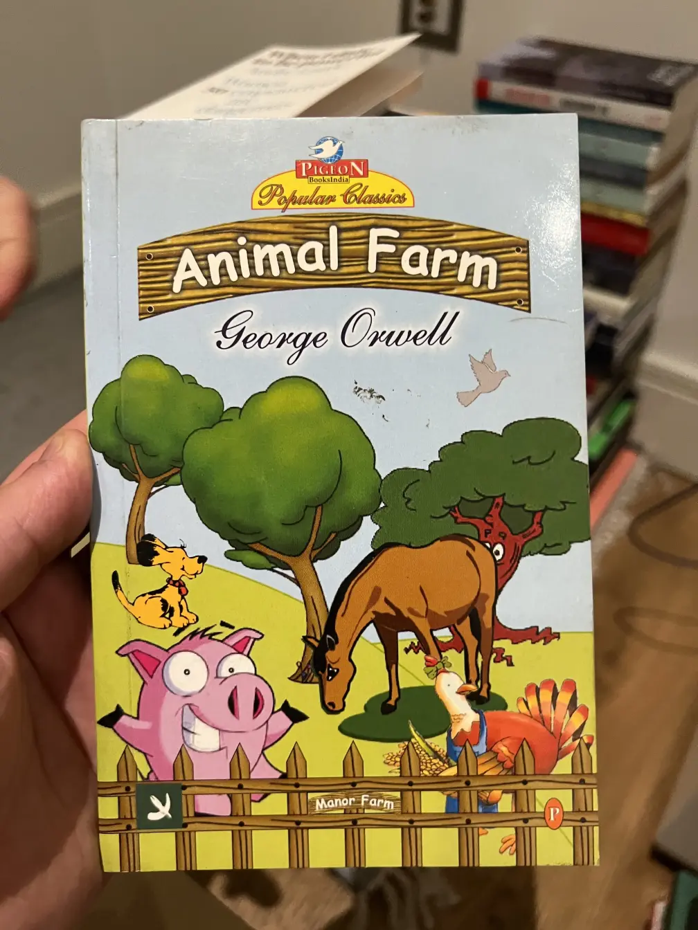
A cover of Animal Farm that might be confused as a Farm Animals colouring book.
The cover is egregious. A collage of clip art with the animals in disparate styles are scattered on the bright green farm without any notion of perspective. It’s as if they’re all from different universes with their own laws of physics. The bright pink pig is smirking, with disembodied eyebrows. Eeyore, dressed up as a horse, is on a flat green patch magically spanning across two mounds. Two trees curved like bananas, one anthropomorphised with googly eyes and leg-like roots. The couldn’t be happier smiling pup with a loyal red collar which looks like a cross between Pluto and Snoopy. The untitled chicken in a confused pose. All of that topped with typography reminiscent of the WordArt from the ’90s. It is bizarre.
Whatever goes upon two legs is an enemy.
Amidst the chaos, there are details that might reassure the reader that there is order. The pig is standing upright, albeit on one leg, which one might assume is a nod to the final maxim four legs good, two legs better. The correct and original name name of the farm, Manor Farm, is bolted on the fence typeset in the friendly Comic Sans. The little hoof and horn symbol near the bottom left is a tiny glimmer of hope in this childish attempt of a cover.
Whatever goes upon four legs, or has wings, is a friend.
All the other animals, are on their fours, or with wings. One might conclude that the pig is the only exception in this set.
No animal shall wear clothes.
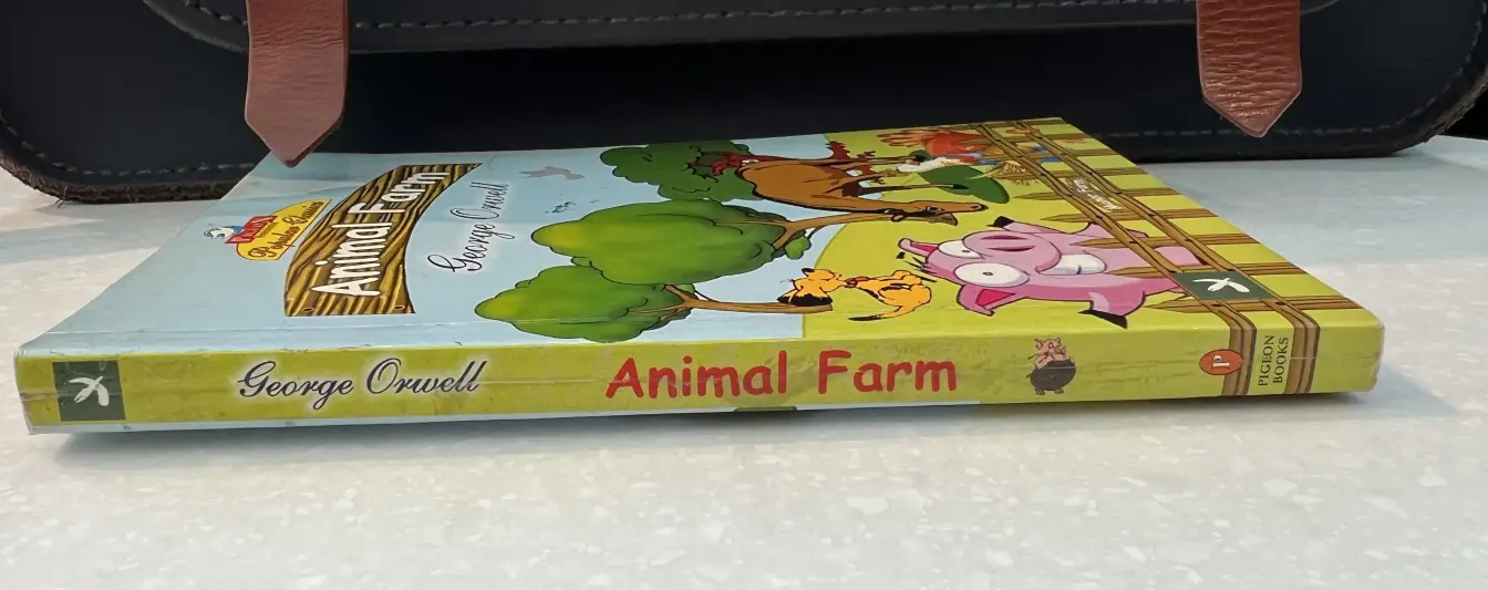
Until one squints and notices the chicken is a barista with a tiny bow on its combs and a denim apron. Its expression is that of one dealing with an order of a latte without milk. Whether these items are full-fledged garments are not, they are clothing. It follows the chicken is an enemy (spy), despite barely having a role in the pages within. There is respite to this contradiction though if one looks at the spine.

The pig standing upright styling a dark brown dungaree holding a straw.
The respite lasts as long as you ignore the typographic atrocities committed. The use of Comic Sans alone is criminal enough, but pairing that with Shelley Script is like pairing Haribo with Ferrero Rocher. The blatant misalignment on the spine, Animal Farm typeset on a curved path on a cartoonish wooden plank with a different curvature than of the text, and the visually unbalanced publisher logo once seen, can’t be unseen.
It is a crime. And maybe that is why it works. The cover’s thoughtlessness is an allegory not too different from the words within its bounds. I won’t be reading this copy published in 2010 by Pigeon Books — I assume no relation to Penguin Books, beyond both being named after birds starting with the letter P. However, I will be taking the book with us. For this move and all the next, as it is one of a kind.